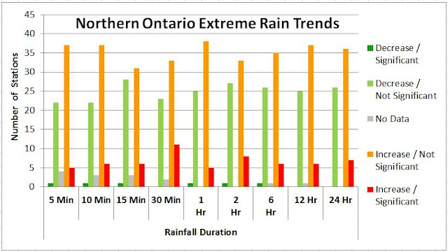
Observed trends show that more southern climate stations have statistically significant decreasing rainfall intensity trends than increasing trends (2.3% compared to 1.0%). In justification for cap and trade in Ontario, scientists and engineers seem to have been muzzled from sharing these simple facts which contradict Ontario's rationale for mitigating climate change. Extreme storms are not increasing as temperature is. Factually, all we have is global warming and no change in rain/weather.
Trends for these southern Ontario (i.e., stations below 44 degree latitude) are shown graphically below:

Over time, the average maximum rainfall intensity is statistically expected to increase as the sample size increases, without indicating a change in the underlying rainfall characteristic. This is so for all skewed probability distributions as any additional sample values (i.e., annual observations) that fall in the extreme tail push the observed mean higher. To illustrate the skew in observations, the following table excerpt from Environment Canada's IDF table (idf_v2-3_2014_12_21_615_ON_6158355_TORONTO_CITY.txt) shows the positive skew values for 5 minute to 24 hour annual maximum observations from 1940 to 2007:
The following charts show histograms of 5 minute and 24 minute annual maximum observations for Toronto City gauge, illustrating this skew characteristic.
The following charts show how sample size affects the ability of samples observations to approximate the mean of an underlying distribution, and how population skew affects the trend in samples mean. This is from Kirk G. Fleming's article "Yep, We’re Skewed", VOLUME 2/ISSUE 2 CASUALTY ACTUARIAL SOCIETY.
Mr. Fleming writes: "Figure 1 shows three lognormal curves, each with a mean of 1,000 and with varying degrees of skewness. As the skewness increases, the mode or highest point on the distribution is associated with points closer and closer to zero.1 For a lognormal distribution with a coefficient of variation (CV) of 2.0, the most likely value for a sample size of one is relatively close to zero, no matter how big the mean of the distribution. For small samples from this skewed distribution, the most likely value for the sample average will be close to zero.
In order to give a feel for what makes up a small sample size, I simulated random values from a lognormal distribution with a mean 1,000 and varying degrees of skewness. The modes for the sample averages of various sizes are shown in Figure 2 for lognormal distributions with a mean of 1,000 and CVs of 0.5, 1.0, 2.0, 5.0 and 10.0. For individual claim size distributions that have low skewness, the most likely value that we will see from a sample average very quickly approaches the mean of the distribution. Many introductory statistical textbooks give a rule of thumb that infinity begins at a sample size of 30, and for low skewness 30 does seem to be a magic number when we are dealing with the lognormal distribution. However, as the skewness increases, it takes a very big sample size before the most likely value of the sample average approaches the mean of the sampled claim distribution.
For a lognormal distribution with a CV of 10, even at a sample size of 500, the most likely value we would see from the sample average is 85% of the distribution mean. Formal credibility formulas aside, I believe many actuaries would consider 500 homogeneous claims to be a fairly large database.
With a CV of 10 and a sample size of 10,000, the most likely value we would see is still only 96% of the mean of the distribution. A simulation size of 10,000 is not an uncommon size for actuaries doing simulations. Even with this large sample, there is still a downward bias of 4% from the actual average of the distribution."
****
Looking at Toronto rainfall data, assuming a log normal distribution of annual extremes as in Fleming's example, and that the CV is in the range of 0.3 to 0.4, this suggests a sample mean would increase over the first decades of the observations as it approaches the true population distribution, and would stabilize near the true mean after 25 years or so. Accordingly, any short duration climate station data trends would increase over time. The median record length (number of samples) is 24 years, indicating that many stations would have a bias in rainfall intensity trend. The natural, statistical increase in rainfall can be confused with a change in underlying rainfall intensity (e.g., due to climate change), whereas the observed increase in extreme intensity is only a known sampling bias in a skewed rainfall probability distribution.
****
Extreme rainfall trends in Canada (Environment Canada Engineering Climate Datasets):
Static Maps: http://www.cityfloodmap.com/2015/12/severe-storm-trends-canada-rainfall.html
Interactive Map: http://www.cityfloodmap.com/2015/12/canadian-extreme-rainfall-map-climate.html
Table Summaries: http://www.cityfloodmap.com/2015/12/canadian-extreme-rainfall-summary-by.html
Chart and Table: http://www.cityfloodmap.com/2015/12/top-weather-story-in-canada-2015-less.html
Long-term Station Table: http://www.cityfloodmap.com/2015/12/long-term-climate-change-short-term.html
Environment Canada Denies Changes: http://www.cityfloodmap.com/2015/10/bogus-statements-on-storms-in-cbcnewsca.html
Contradicting Insurance Industry Claims: http://www.cityfloodmap.com/2015/12/trends-in-canadian-shortduration.html
 |
| Rainfall sample mean bias for skewed distribution results in samples means that are less than the underlying population mean. Underestimation bias increases with higher skew distributions. |
****
Extreme rainfall trends in Canada (Environment Canada Engineering Climate Datasets):
Static Maps: http://www.cityfloodmap.com/2015/12/severe-storm-trends-canada-rainfall.html
Interactive Map: http://www.cityfloodmap.com/2015/12/canadian-extreme-rainfall-map-climate.html
Table Summaries: http://www.cityfloodmap.com/2015/12/canadian-extreme-rainfall-summary-by.html
Chart and Table: http://www.cityfloodmap.com/2015/12/top-weather-story-in-canada-2015-less.html
Long-term Station Table: http://www.cityfloodmap.com/2015/12/long-term-climate-change-short-term.html
Environment Canada Denies Changes: http://www.cityfloodmap.com/2015/10/bogus-statements-on-storms-in-cbcnewsca.html
Contradicting Insurance Industry Claims: http://www.cityfloodmap.com/2015/12/trends-in-canadian-shortduration.html


