Can We Use Daily Rainfall Models To Predict Short Duration Trends? Not Always - Observed Daily and Short Duration Trends Can Diverge

One can assess trends in rainfall intensities over various durations and return periods using Environment Canada's Engineering Climate Datasets.  National trends based on updating 226 station IDF curves were shown in an earlier post.

What are the trends in regions of Canada that have experienced significant flooding in the past?  And do the trends projected by models for long durations (1 day precipitation) match observed data trends?  No - some 24-hour trends are decreasing despite models estimating they will go up (or have gone up because of increasing temperatures).

Also, what is happening with observed short duration intensities, the ones responsible for flooding in urban areas, compared to the observed 1-day trends?

The data show short duration and long duration trends diverge. Therefore relying on models of 1 day precipitation to estimate what is happening with short duration, sudden, extreme rainfall should be done with caution.

A couple charts help illustrate these observed data trends and show what is wrong with relying directly on models to project local extreme rainfall.

This is the trend in observed rainfall for southern Ontario climate stations, using median changes in IDF statistics:

Southern Ontario Extreme Rainfall Trends

Long duration intensities are decreasing and short duration intensities are decreasing even more.  The extreme intensities (red dots = 100 year, orange dots = 50 year) decrease more than the small frequent storm intensities (green dots = 2 year).  Observed data diverges from Environment Canada models that suggest intensities are going up due to a warmer climate (see recent CBC article).

These are the trends for Alberta observed rainfall when new data are added and are reflected in the most current v3.10 datasets:

Alberta Extreme Rainfall Trends

In Alberta, long duration intensities decrease significantly (100 year is down by 4% on average).  Meanwhile the short duration intensities increase.  The long duration decrease is contrary to Environment Canada's simulation models that estimate 1 day rainfall at a sub-continental scale.

In northern Ontario, trends are different than in southern Ontario as shown below:

Northern Ontario Extreme Rainfall Trends

In northern Ontario the long duration intensities have increased but short duration intensities have decreased on average.  So we see short and long duration rainfall trends are diverging when we consider new data.

Climate modellers may suggest that simulated 1 day precipitation can guide what happens during short durations too.  Observed data suggest otherwise.  Trends actually diverge.

In brief, for this sample of regions shown above, we see these trends:

Location                 Short Duration Trend         Long Duration Trend

Southern Ontario      Larger Decrease                        Decrease
Northern Ontario            Decrease                              Increase
Alberta                            Increase                               Decrease

Remember "All models are wrong, some are useful".  Climate models do not accurately project changes in extreme rainfall in Canada based on observed data.  Furthermore, simulated 1 day precipitation trends from models cannot be used to assume short duration trends related to flooding in urban areas - short and long duration rainfall trends are observed to change in opposite directions in sample regions across Canada.

When using 1 day rainfall trends to estimate short duration trends, given the actual observed data trends above, it may be appropriate to conduct sensitivity analysis on potential shorter duration trends, especially if those shorter durations influence system behaviour (e.g., 'flashy' urban drainage systems).  Those short duration trends trends may be in an opposite direction or magnitude than the 1 day trends. For example, in Northern Ontario the 1 day 100-year intensities have increased 2% as a result of the most recent IDF data updates, however the intensities for durations of 2 hours or less have mostly decreased.

The following chart compares the 30 minute, 1 hour and 2 hour 100-year intensity trends with the 24 hour 100-year trends at 226 climate stations across Canada.


The correlation of short duration trends with 24 hour trends is weak with R-squared value of 0.12 for 2 hour trends, 0.06 for 1 hour trends and 0.006 for 30 minute trends.  This suggests that short duration trends are not correlated with 24 hour trends.   

***

Given recent flooding in British Columbia, it is worthwhile looking at trends in design rainfall intensities in BC. This chart shows that extreme rainfall intensities (red dots with 100-year return period, orange dots with 50-year return period) have not increased for most durations - the 12 hour duration intensities are up slightly on average (less than 0.5% increase), while other duration intensities have decreased by more than 2 % on average (5-minute 100-year intensities).


For the longest duration of 24 hours, intensities have decreased on average - typical 2-year intensities are unchanged on average while the moderate and extreme intensities (5-years, 10-year, 25-year, 50-year and 100-year) have decreased on average.

The following tables shows trends in observed annual maximum rainfall over various durations at BC climate stations with long-term records. These are called the Annual Maximum Series (AMS). Trends in derived design rainfall intensities above (e.g., 2-year to 100-year rainfall rates) follow these trends in AMS.


Super Models vs Dowdy Data - How Climate Models Diverge From Observations On Extreme Weather

A recent special article in the Financial Post noted the difference between models and observations on extreme rainfall: link

Recent reporting by CBC and Radio Canada International (RCI) have reported shifts in extreme rainfall frequency, stating that there is confirmation that a warmer climate is now making extreme rainfall more frequent and intense.  The confirmation, however, was from models analyzed by Environment Canada, and not actual measured rainfall.

As pointed out in the Financial Post article, both CBC and RCI confused models with actual observed data in stating broad confirmations.  They overlooked limitations in the models to represent local events and extreme events, omitted data that showed all the models were wrong in some regions (projected increasing rainfall when data showed decreasing rainfall), and failed to mention that other climate effects like less snow in a warmer climate can decrease flood risk, mitigating precipitation increases.

Fundamentally, observed rainfall frequencies and model frequencies are not consistent, despite RCI and CBC reporting.  The following tables show the clear difference between what models project could happen and what actual data show has happened.

This first table relates to the recent CBC and RCI reporting on a North American climate model.  The model predicts that 100 year storms become 20 year storms (i.e., for a given intensity), meaning more frequent.  Alternatively, the model says that intensities of a given frequency are higher.  In contrast, the observed data for Canada show a slight decrease in 100 year intensities at 226 climate stations, meaning storms of a given intensity are are not more frequent, but rather slightly less frequent when recent data are factored in.

Extreme Rainfall in Canada - Trends in Modelled vs Observed Data for 100 Year Storm

The second table below is for the 50 year return period storm - it shows projected model return period shifts of 50 to 35 years from model.  The results are averaged across Canada.  In comparison, 226 climate stations across Canada have observed that results in a slight decrease in 50 year storm intensities.  Like the 100 year storm above, that means actual storm frequencies are lower now.  Old 50 year return periods are now longer than 50 years now.  

Extreme Rainfall in Canada - Trends in Modelled vs Observed Data for 50 Year Storm
The CBC reported the above 50 to 35 year model shift as actually having already occurred in its In Our Backyard interactive: (see flooding tab) https://www.cbc.ca/news2/interactives/inourbackyard/
The CBC claimed that intensities in Toronto are greater today, resulting in more flooding.

While it is challenging to draw conclusions from trends at individual climate stations, shifts at a couple of  Toronto climate stations are shown in the 100 year and 50 year tables as well to check the CBC reporting.  The Toronto Pearson International Airport and Toronto City (aka Bloor Street) gauges have very long records to compare old and new intensities.

The old Pearson 100 year 24-hour storm intensity (top table) is now a  417 year storm, meaning it occurs much less frequently now.  Alternatively, the magnitude of the 100 year storm intensity has dropped from past to present, meaning such storms are less severe.  This decline occurred despite that climate station recording the large July 8, 2013 storm.  The 50 year storm is now a 108 year storm, again less frequent than before.

Clearly local data at Pearson Airport, just outside of Toronto is not changing the same way that the Canadian model projections are.  Observed frequencies are longer, while the model estimated them to be shorter.

The Toronto City climate station shows only small changes in 24-hour storm frequency.  The 100 year frequency is slightly shorter at 97 year. Meanwhile the 50 year frequency is slightly longer at 52 year.  These changes are nominal and represent no significant overall change.  They are consistent with the average changes at 226 stations across Canada that also showed no appreciable change when 10 additional years of data were analyzed.  Across Canada, 100 year and 50 year rainfall intensities decreased slightly overall - the 100 year intensities decreased 0.5% and the 50 year intensities decreased 0.6%.

Clearly local data at Toronto City, essentially downtown Toronto, shows no change in extreme storm frequency or intensity, contrary to the CBS's reported model estimates.

To not rely on just a couple Toronto stations, one can look at at changes in intensities at all long term southern Ontario climate stations that have recent data updates.  Comparing the Engineering Climate Datasets v2.00 with data up to 2007 and v3.10 with data up to 2017 one can see a slight decrease in 50 year and 100 year 24-hour intensities, on average.  The stations and their lengths of record are shown below:

Southern Ontario Long Term Climate Stations with Recent IDF Updates (v2.00 to v3.10) - Environment Canada Engineering Climate Datasets
Overall, there are 978 station-years of data to analyze trends.

In southern Ontario the 100 year 24-hour intensities decreased by 1.0% while the 50 year intensities decreased by 0.9%, when additional data was added.  This suggests that the regional trends in Toronto per the Toronto City climate station, showing no overall change, are consistent with other stations in the region.  The southern Ontario data does not support the North American or Canadian model estimates reported by CBC and RCI that expect shorter return periods and higher intensities.

So beware of media reports that mix up models with actual observed data.

***

The following image expand on the tables above, showing where CBC and RCI made reference to the climate model results, and the text used to describe 'confirmation' of changes in rainfall.  Links to comparison charts (some that were in earlier posts) and tables are also included, showing the actual observed data trends and indicating Environment Canada source material.

Click to enlarge:

Comparison of 100 Year Return Period Rainfall Trends in Canada - Climate Models vs Observed Data, CBC and RCI Reporting

Comparison of 50 Year Return Period Rainfall Trends in Canada - Climate Models vs Observed Data, CBC Reporting 


How Have Rainfall Intensities Changed in Canada Over the Past 10 Year? Not Much. Extreme 100-Year Rainfall and Short Duration Intensities Causing Flooding Are Lower

Environment and Climate Change Canada's Engineering Climate Datasets including rainfall intensity duration frequency (IDF) statistics are regularly updated as observation records become longer, and more and more stations have sufficient data to analyze.

What do the recent updates show? There is no new normal in design rainfall intensities.  Over the past 10 years, the severity of extreme rainfall has decreased on average.

Short duration sudden rainfall rates responsible for flooding in urban areas have also decreased overall - only the frequent, low intensities show an overall increase, which can be expected given additional precipitation in Canada. Of course some regions may have different trends (a previous post has shown that the southern Ontario frequent intensities (i.e., 2-year return period) have decreased).

Where do design intensities, the statistics in IDF curves and tables, come from?

Annual maximum series (AMS) of recorded rain intensity are collected for duration intervals of 5 minutes to 24 hours.  These series are used to derive probability density functions to describe the frequency distribution of rainfall, and that can be used to determine specific 'return period' design intensities.  The return period is the inverse of the probability of a rainfall intensity (or volume) over a certain duration occurring during a given year.  So a 100-year intensity has a 1/100 or 1% chance of being exceeded each year, while a 2-year intensity has a 1/2 = 50% chance per year. Storm sewers are designed to convey 2, 5 to 10-year return period rain intensities - 5-year is most common.  Flooding, especially extreme flooding, occurs at higher return periods becoming more severe above the 25-year return period and increasing for 50 and 100-year intensities.

The recent version 3.10 update to IDF statistics analyzes rainfall data up to 2017.  These intensities can be compared to the version 2.00 datasets that included data up to 2007.  A total of 226 stations were analyzed to check for changes in intensity - this total includes about 72 stations that have been relocated, but by not more than 5 km from their previous location.  The same trends are apparent for all the exact match stations (92 stations) and stations with new IDs but unchanged coordinates (154 stations).

The following chart shows the ratio of new intensities to old intensities for these 226 stations, so 1.0 means no change in design intensities.

Extreme Rainfall Trends in Canada - Design Intensities by Duration and Return Period

What are the take-aways?

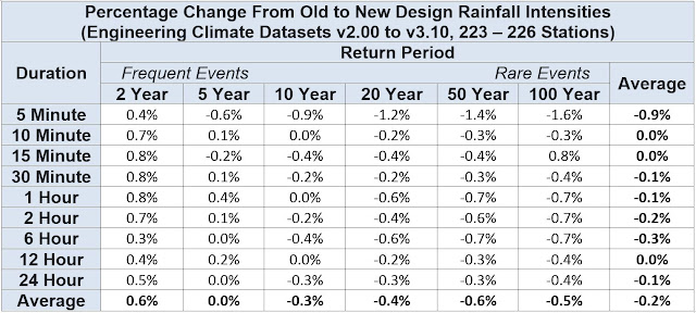
1) rainfall design intensities are generally unchanged over the past 10 years, considering 3313 station-years of additional data,

2) extreme rainfall intensities, the 100-year rates (red markers in the chart), have decreased - the shortest duration intensity governing urban flood risk has dropped the most,

3) short duration intensities that govern sewver design, 5-year return period intensities (purple markers) over 5-minute to 2 hour durations are unchanged on average,

4) 2-year intensities (green markers), the low intensity rainfall that is exceeded in 50% of years, has increased slightly - these intensities do not govern infrastructure design and are unrelated to urban flash flooding or flood damages.

Popular media has focused on theoretical changes in rainfall intensity, sometimes confusing those projections with actual changes in rainfall intensity that have been measured or observed.  See this review of recent CBC coverage in the Financial Post.  Increasing damage amounts are erroneously linked to changes in rainfall due to a changing climate.

If popular media were to focus on observed data, and actual trends in extreme rainfall statistics, like the trends reviewed above, it would have to temper claims of a new normal in extreme weather.  Data do not show increases the critical rainfall intensities - in fact, on average, extreme intensities have decreased.

Changes in v2.00 to v3.10 dataset intensities are shown in the tables below.

Severe rainfall trends in Canada due to climate change
Extreme Rainfall Trends in Canada - Engineering Climate Datasets - IDF Curves


The analysis above is based on assessing the effect of adding additional data to the v2.00 IDF data intensities.  It is also possible to assess the effects of new data by splitting the series into old and new halves to compare IDF intensities and look for trends.  The following charts show the change in two long-period climate stations in the Toronto area.   Rainfall volumes are shown for a 24 hour period - intensities would be simply the volumes divided by 24 hours.

Toronto Pearson International Airport Climate Station - Changes in 24 Hour Rainfall Frequencies

For the Toronto Pearson International Airport climate station, the return periods of the old period volumes (blue line) have shifted right in the new data set, meaning longer return periods for a given volume, i.e., lower frequency.

The chart also compares how a climate model has predicted return periods have changed from 1961 to 2010, covering approximately a similar period.  Those model frequency shifts were reported by the CBC (link: https://www.cbc.ca/news/technology/extreme-rainfall-climate-change-1.5595396) and considered a 1 degree warming scenario. The climate model predicts lower return periods for a given volume, meaning that volume occurs more frequently - that is not consistent with observed local data at this station that has shown significantly longer return periods in the new period.

Toronto City Climate Station - Changes in 24 Hour Rainfall Frequencies

For the Toronto City (downtown) climate station, the return periods of the old period volumes (blue line) have shifted slightly right in the new data set, meaning slightly longer return periods for a given volume, i.e., slightly lower frequency.

The chart again compares climate model return periods for 1961 to 2010.  Again, the model, which represent a large area, and not necessarily the specifics of the Toronto area predicts lower return periods for a given volume, meaning that volume occurs more frequently - that is not consistent with observed local data at this station that has shown no significant change.

It is possible to look at the change in intensity as opposed to the change in frequency.  The following chart for Toronto Pearson International Airport climate station presents the same data but expresses the changes in terms of intensity, as opposed to frequency.

Toronto Pearson International Airport Climate Station - Changes in 24 Hour Rainfall Volumes
Often you can read in media reports that both the frequency and intensity increased over time - this is a peculiar way to express changes as that data can be used to show a change in one or the other but realistically not both at the same time.  To show the change in frequency and the change in intensity would mean allocating the change in some proportion to the two.

***

Do we have enough weather stations to analyze trends in observations - yes! - we are getting more and more stations and data over time - see previous post regarding additional Environment Canada stations since 1990.

In addition, municipalities are adding 100's of stations to support local studies as described in another post. More rain intensity data than ever before.

Although the data shows less extreme rainfall in Canada, some confuse models that predict future conditions and measured data.  The CBC misinterpreted a model predicting that 50 year storms would happen every 35 years in a time period out to 2015, and reported that this projections has already happened - read more about that here.